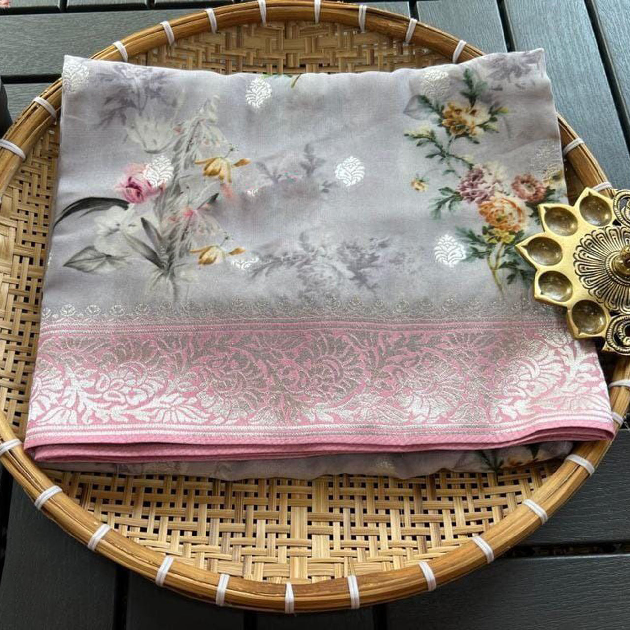
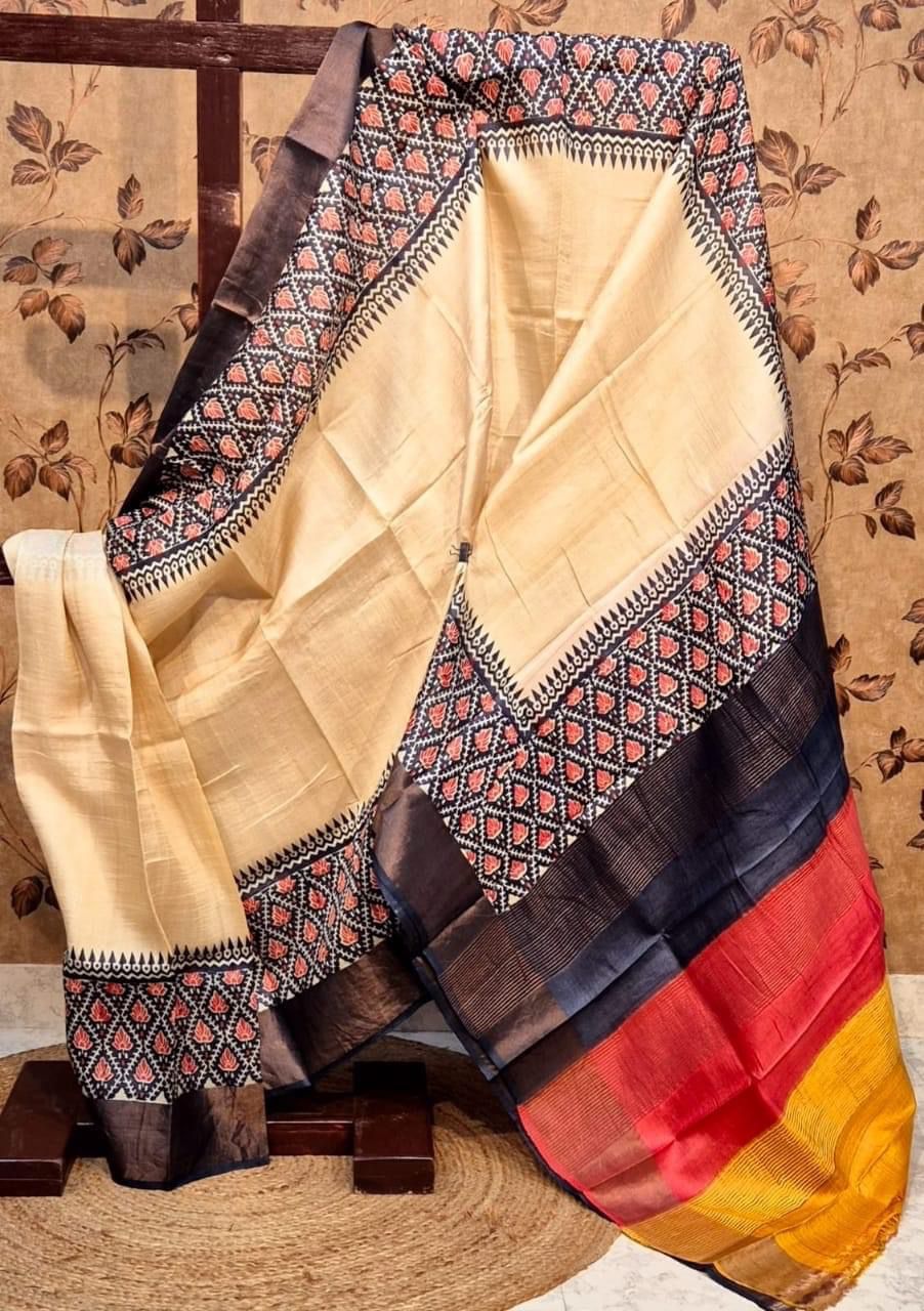
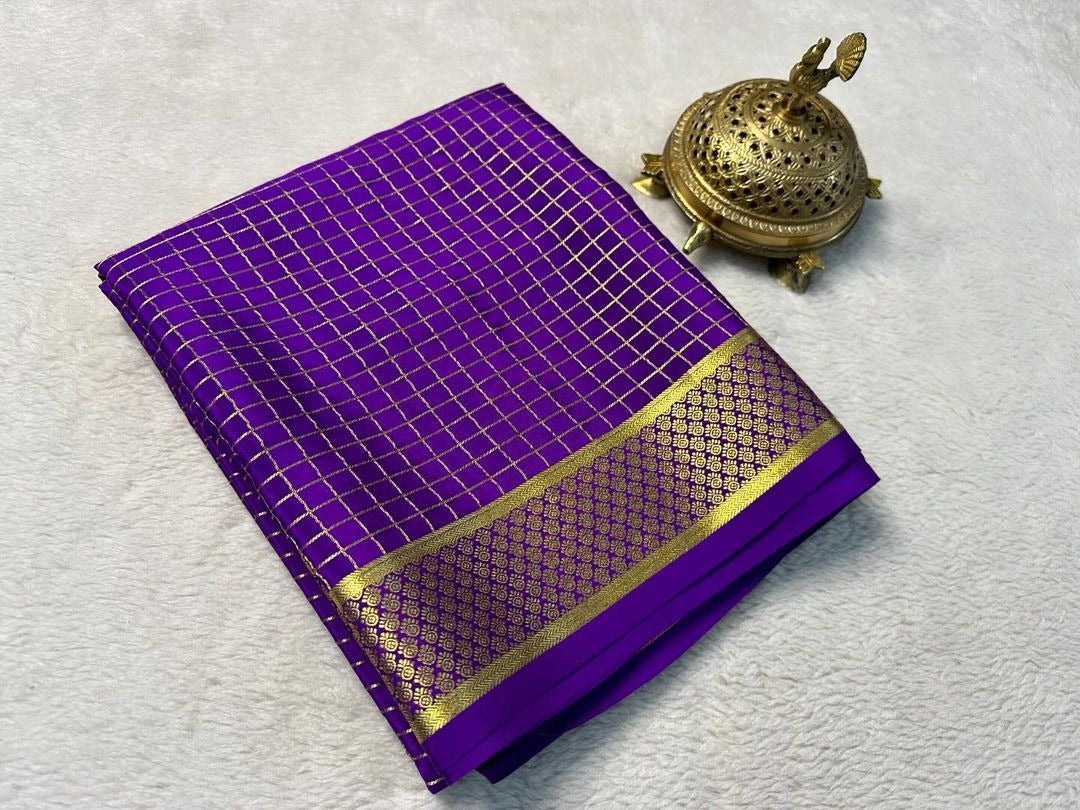
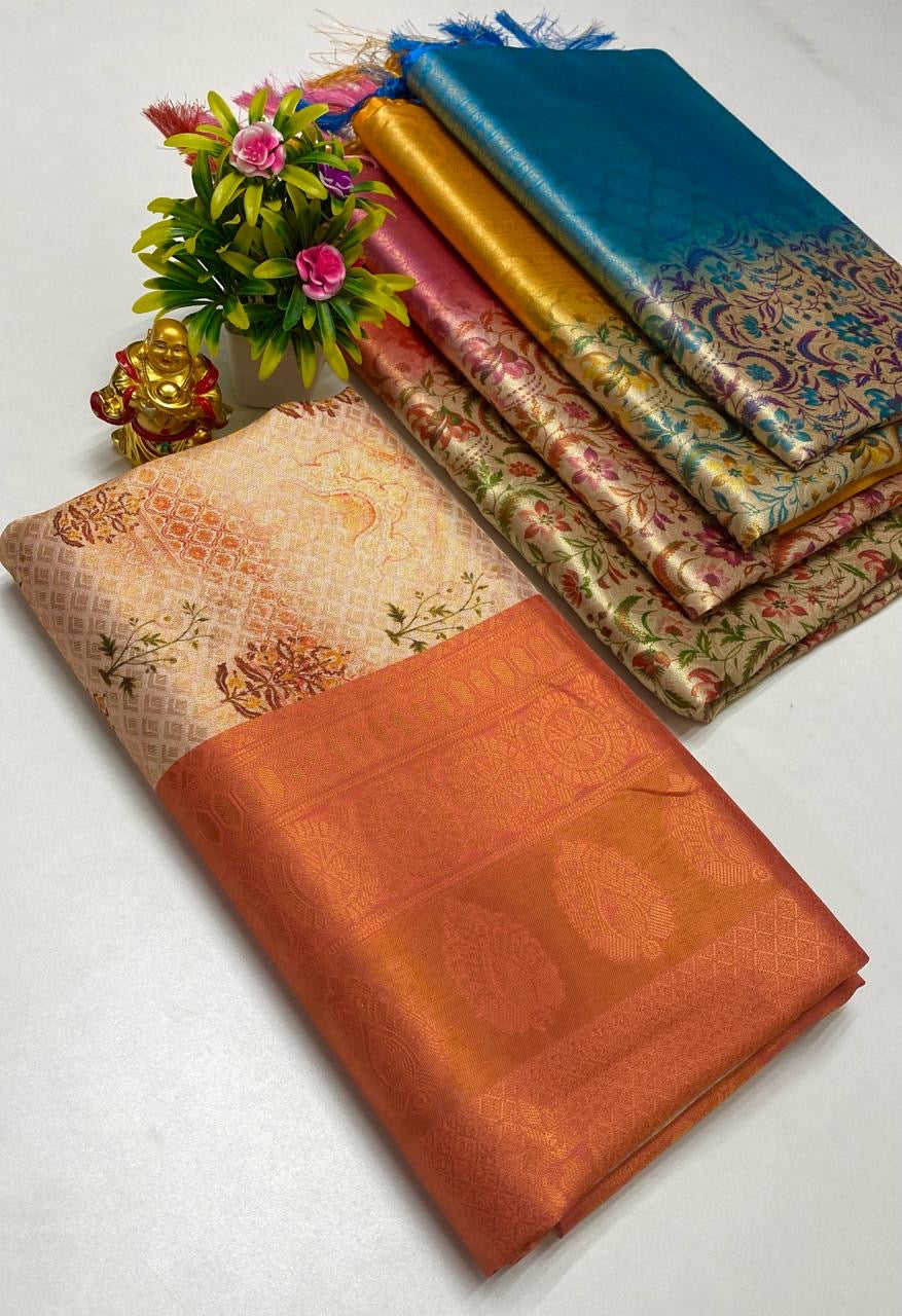









How Color and Print Placement Transform Your Saree Look
When shopping for a saree, most women focus on the design, fabric, or latest trends. While these factors are important, two often-overlooked elements can have an even bigger impact on how a saree looks when worn: color and print placement.
The same saree design can create completely different visual effects depending on its colors and how the prints are arranged across the fabric. In fact, professional fashion designers carefully use color psychology and print positioning to create garments that enhance body proportions, highlight strengths, and create a more balanced appearance.
Understanding these principles can help you choose sarees that not only look beautiful on display but also flatter your individual features and personal style. Whether you prefer floral printed sarees, abstract designs, botanical motifs, or traditional patterns, knowing how color and print placement work can transform the way you shop and style your wardrobe.
Why Color Matters More Than You Think
Color is often the first thing people notice about an outfit.
Before anyone observes the fabric, pattern, or detailing, the color creates an immediate visual impression.
Colors influence:
- Perceived body proportions
- Mood and personality
- Visual balance
- Formality level
- Overall style statement
The right color can instantly elevate your appearance.
Understanding the Visual Power of Dark Colors
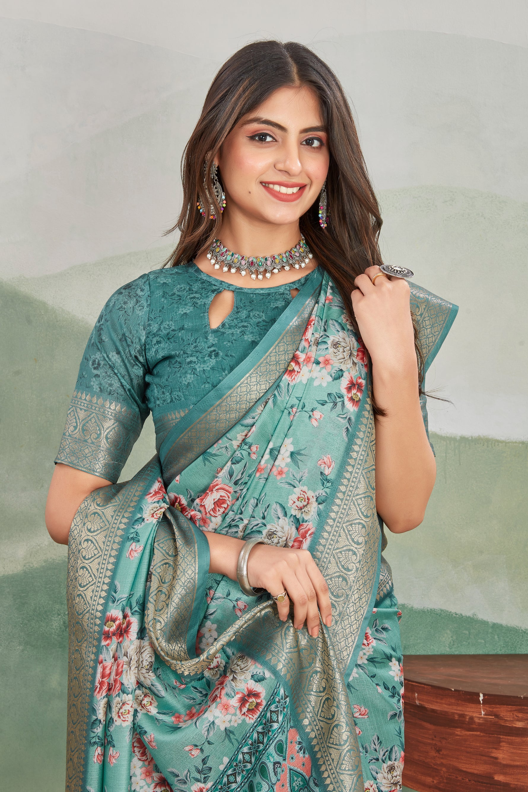
Dark shades have long been considered flattering because they create a slimming visual effect.
Popular choices include:
- Black
- Navy blue
- Deep maroon
- Emerald green
- Charcoal grey
Why Dark Colors Work
They tend to:
- Create visual depth
- Minimize volume
- Produce a streamlined appearance
This is why many women choose darker sarees for formal occasions.
How Light Colors Create a Different Effect
Light shades can make areas appear larger and more prominent.
Popular options include:
- Ivory
- Beige
- Soft pink
- Lavender
- Powder blue
- Mint green
Benefits of Light Colors
They create:
- Freshness
- Soft elegance
- Airy sophistication
Light-colored sarees are particularly popular for daytime events.
The Psychology of Popular Saree Colors
Different colors communicate different impressions.
Red
Associated with:
- Confidence
- Celebration
- Energy
Blue
Represents:
- Calmness
- Sophistication
- Professionalism
Green
Symbolizes:
- Nature
- Growth
- Harmony
Pink
Reflects:
- Femininity
- Romance
- Grace
White and Ivory
Suggest:
- Simplicity
- Elegance
- Purity
Choosing colors aligned with the occasion enhances overall impact.
What Is Print Placement?
Print placement refers to the way motifs, patterns, and artwork are arranged across the saree.
Designers carefully consider:
- Pattern size
- Distribution
- Density
- Direction
- Focal points
Strategic print placement can dramatically influence how a saree appears when worn.
Why Print Placement Is So Important
The human eye naturally follows visual patterns.
Well-positioned prints can:
- Create balance
- Guide attention
- Enhance proportions
- Add elegance
Poorly placed prints may make an outfit appear cluttered or unbalanced.
Small Prints vs Large Prints
One of the most important decisions in printed saree design is motif scale.
Small Prints
Characteristics:
- Subtle appearance
- Refined elegance
- Timeless appeal
Best suited for:
- Office wear
- Professional settings
- Everyday styling
Small prints often create a visually streamlined effect.
Large Prints
Characteristics:
- Bold impact
- Contemporary appeal
- Statement-making style
Best suited for:
- Parties
- Social events
- Fashion-forward looks
Large motifs naturally attract attention.
How Print Density Affects Appearance
Density refers to how closely patterns are positioned.
Dense Prints
Feature:
- Frequent motifs
- Rich visual texture
Can create a vibrant and dramatic appearance.
Sparse Prints
Offer:
- Breathing space
- Minimalist elegance
- Clean aesthetics
Many luxury sarees intentionally use controlled spacing for a more sophisticated effect.
Border Design Influences Proportions
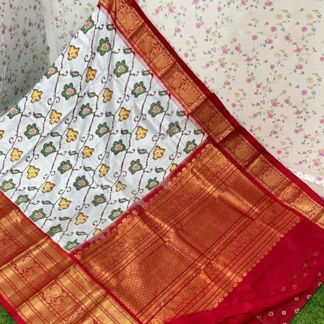
The saree border acts like a visual frame.
Its width and design can significantly affect appearance.
Thin Borders
Create:
- Delicate elegance
- Contemporary styling
Wide Borders
Offer:
- Traditional appeal
- Strong visual structure
Choosing the right border helps achieve balanced proportions.
Vertical Prints Create a Lengthening Effect
Patterns that emphasize vertical movement tend to make the wearer appear taller.
Examples include:
- Vertical floral vines
- Elongated motifs
- Directional artwork
This effect is widely used in fashion design.
Horizontal Elements Create Width
Patterns arranged horizontally can create the illusion of broader proportions.
While not necessarily undesirable, understanding this effect helps in making informed choices.
Strategic Pallu Design Matters
The pallu is often the most decorative part of a saree.
Designers frequently use it as a focal point.
Popular Pallu Styles
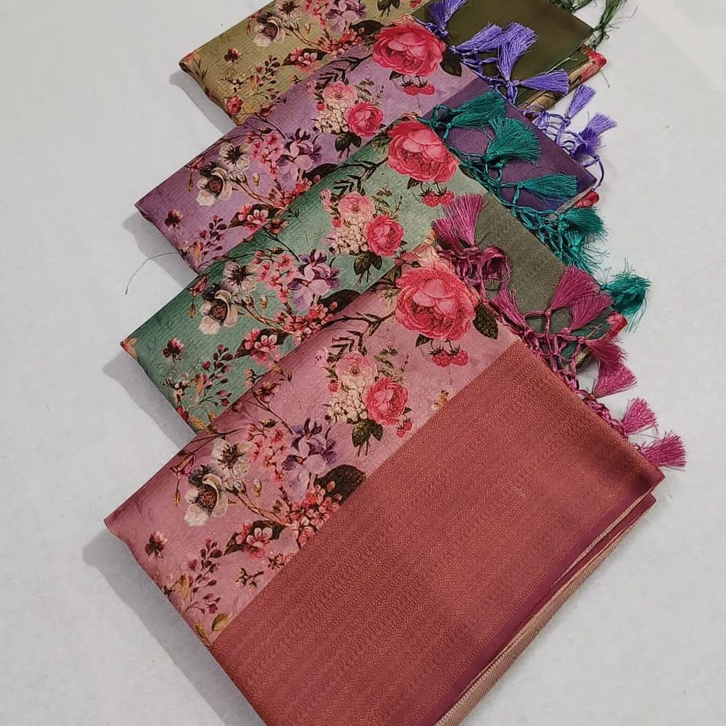
- Large floral artwork
- Botanical scenes
- Abstract compositions
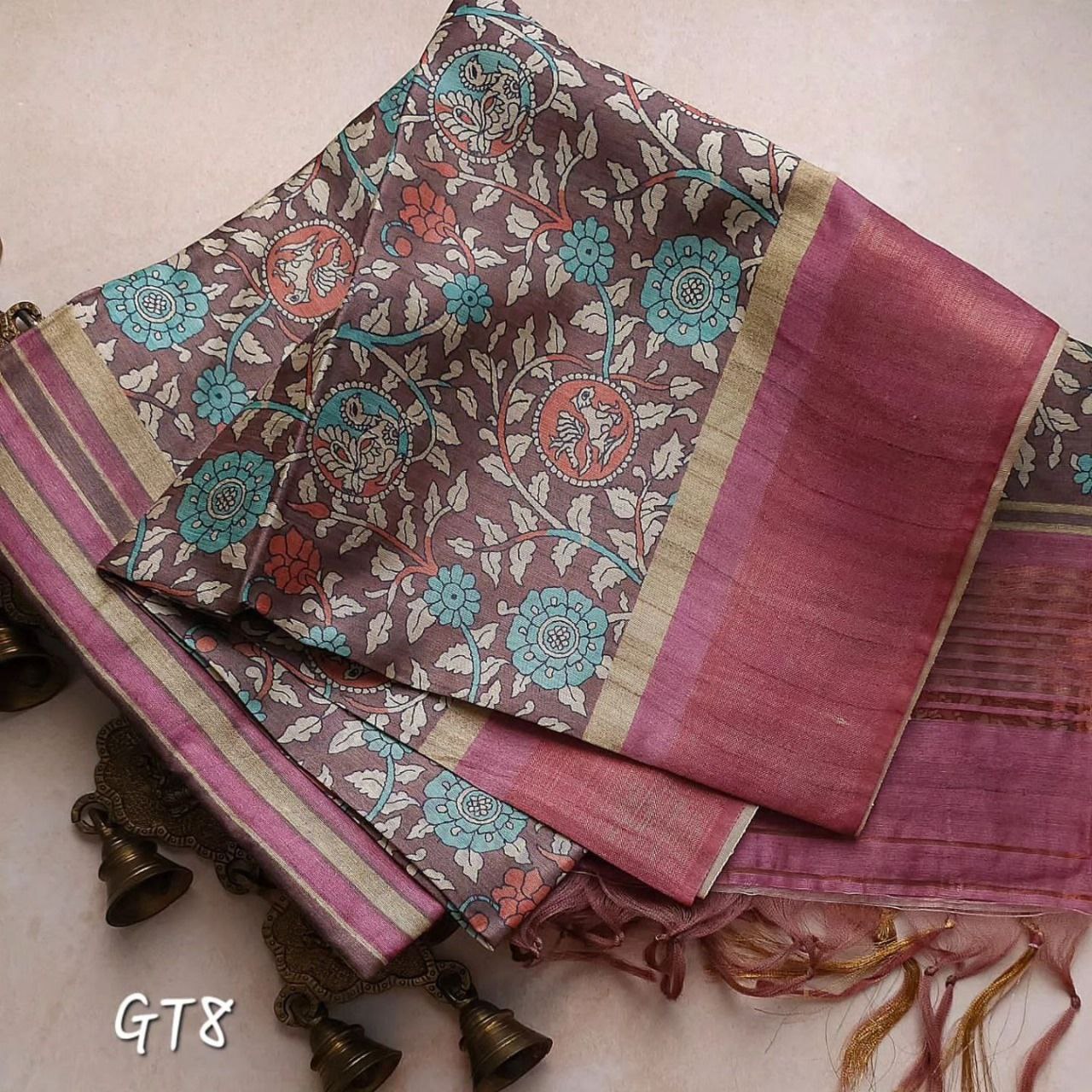
- Traditional motifs
A well-designed pallu enhances the overall elegance of the saree.
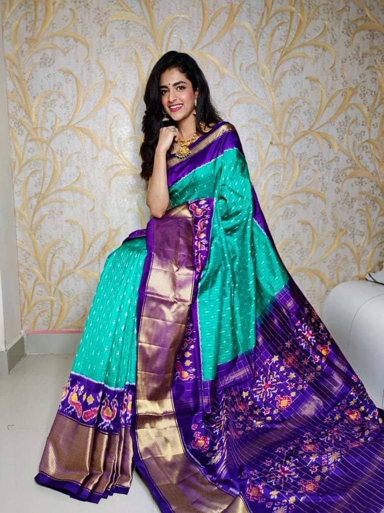
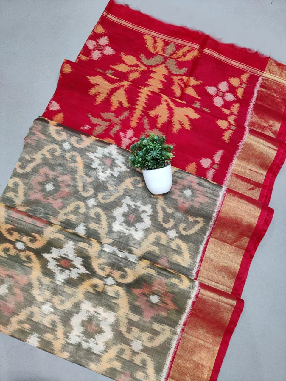
How Color Blocking Changes Visual Balance
Color blocking involves combining different colors within a single garment.
In sarees, this may appear through:
- Contrasting borders
- Distinct pallu sections
- Multi-toned designs
Color blocking can:
- Highlight specific areas
- Create structure
- Add modern appeal
Choosing Colors According to Occasion
Day Functions
Popular choices include:
- Pastels
- Soft florals
- Light botanical shades
These colors appear fresh in natural light.
Evening Events
Richer tones often work better.
Examples include:
- Wine
- Navy
- Emerald
- Deep plum
These shades create elegance and drama.
Office Wear
Professional environments often favor:
- Muted tones
- Neutral palettes
- Sophisticated prints
Balance is key.
How Print Placement Enhances Different Body Shapes
Understanding print placement helps create visual harmony.
Balanced All-Over Prints
Provide:
- Consistency
- Versatility
- Universal appeal
Concentrated Focal Prints
Draw attention toward specific areas.
Border Emphasis
Can strengthen visual structure and create definition.
The goal is always balance rather than disguise.
Why Designer Sarees Often Look More Flattering
Professional designers understand visual composition.
They carefully balance:
- Color palettes
- Motif size
- Pattern distribution
- Fabric movement
This attention to detail often explains why designer sarees feel more polished.
Current Trends in Color and Print Placement
Modern saree fashion increasingly favors:
Nature-Inspired Color Palettes
Including:
- Sage green
- Terracotta
- Dusty rose
- Botanical tones
Oversized Botanical Prints
Large artistic motifs continue to trend.
Minimalist Placement Designs
Selective artwork with generous spacing creates a luxury feel.
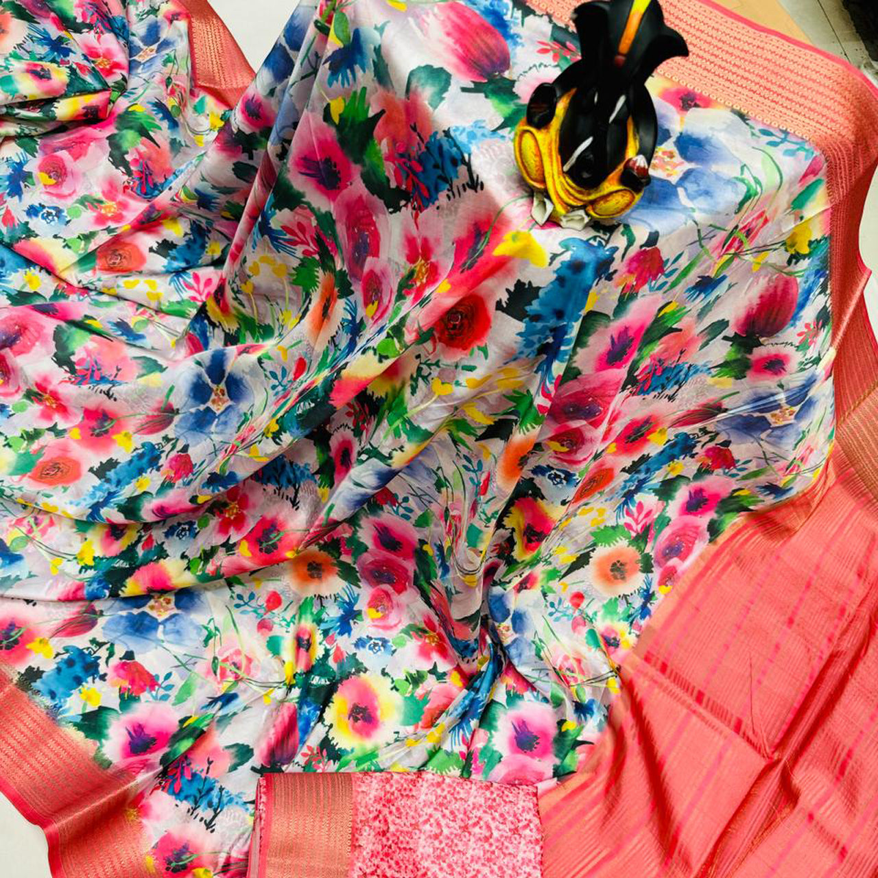
Watercolor Effects
Soft transitions and artistic blending remain popular.
Common Mistakes to Avoid
Choosing a Print Solely Based on Trend
Personal style should remain the priority.
Ignoring Color Versatility
Extremely trend-specific shades may limit wearability.
Overlooking Print Scale
Pattern size should feel balanced and comfortable.
Pairing Busy Prints with Busy Accessories
Allow the saree to remain the focal point.
How to Find the Perfect Combination
When selecting a printed saree, consider:
- Your personal style
- Preferred color palette
- Intended occasions
- Fabric quality
- Print composition
The best sarees combine all these elements harmoniously.
Frequently Asked Questions
Do dark-colored sarees really look more slimming?
Dark shades often create a visually streamlined appearance, which many people perceive as slimming.
Are large prints fashionable?
Yes. Oversized botanical and artistic prints are among the biggest saree trends today.
Which colors are most versatile?
Navy blue, black, maroon, emerald green, beige, and ivory are highly versatile options.
What is the most elegant type of print placement?
Balanced motifs with thoughtful spacing often create the most sophisticated appearance.
Does print placement matter more than color?
Both are important. The most flattering sarees combine effective color selection with strategic print placement.
Conclusion
Color and print placement are two of the most powerful tools in saree design. While fabric and craftsmanship remain important, the way colors interact with prints ultimately determines how a saree looks when worn. Thoughtful color choices can create elegance, confidence, and versatility, while strategic print placement enhances visual balance and overall style.
Whether you're choosing a floral saree, a botanical design, an abstract print, or a traditional motif, understanding these principles helps you make smarter fashion decisions. Instead of simply following trends, you'll be able to select sarees that complement your personality, suit different occasions, and remain flattering for years to come.
The next time you shop for a printed saree, pay attention not only to the design itself but also to how the colors and prints are arranged. You may discover that these subtle details make all the difference between a saree that looks attractive and one that looks truly extraordinary.
- #body type saree tips
- #Body Type Styling
- #Botanical Sarees
- #Color and Print Placement
- #Color and Print Placement in Sarees
- #Designer Sarees
- #Ethnic Wear
- #Fashion Styling
- #flattering saree prints
- #Floral Sarees
- #Indian Fashion
- #print placement in sarees
- #Printed Saree Trends
- #Printed Sarees
- #Saree Buying Guide
- #Saree Colors
- #Saree Fashion Guide
- #Saree Styling Tips
- #Women's Fashion
Share